
In the digital landscape, the navigational compass of your website menu design. It guides visitors and potential customers through your user interface, shaping their journey and influencing how long they stay to explore what your website offers. Your website’s menu is not just about aesthetics; it’s a vital element that impacts user experience and provides essential information, including promotions and sales, that users may not have even known they needed. In this article, we’ll be your guide, helping you steer towards a successful, user-friendly website. Stick with us until the end for the cream of the crop insights.
Different Types of Website Menu Styles
Website Menu Designs come in various styles, each with its own unique characteristics and advantages. Let’s explore these options to help you choose the most suitable one for your website.
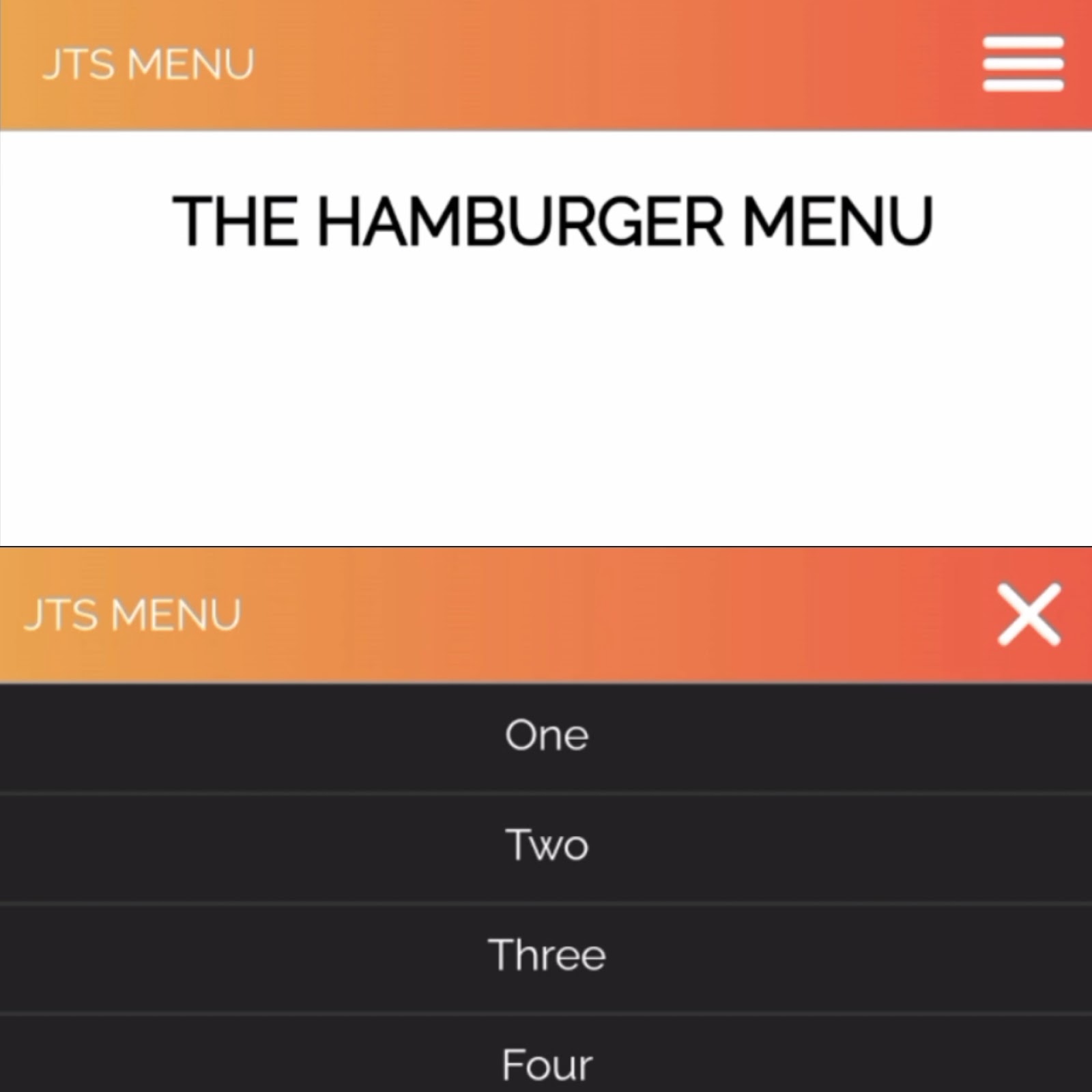
The Famous Hamburger Mobile Menu
The Hamburger Menu: A Space-Saving Marvel
This website menu design, aptly named for its three horizontal lines resembling a burger, offers a space-saving solution for mobile devices. However, while it serves its intended purpose efficiently, it can also pose challenges. Users often find themselves navigating back to the home page, selecting the main category, and then the subcategory just to access specific content. It’s like uncovering hidden treasure within a main category each time, and this can become cumbersome.
Standard Horizontal Menu
Elegance in Simplicity: The Standard Horizontal Menu
The standard horizontal website menu design is a classic choice. Positioned at the top of your website, it maintains consistency across all pages. Its left-to-right navigation mirrors the way readers consume content, making it intuitive. However, it’s important to note that horizontal menus have limited space, so it’s crucial to prioritize important pages, such as your Contact page.
A Vertical Sidebar
Vertical Sidebar: A Spacious Yet Delicate Balance
For those considering left or right-hand placement of information, the vertical menu might be your best bet. It offers ample space for links and content, but be cautious not to overwhelm users with excessive information. Less is often more in this case, as overcrowding can deter potential customers.
A Drop Menu
Drop Menu: Instant Access, No Scrolling Required
The drop-down menu is all about convenience. Users can access vital information with a single click, eliminating the need for scrolling. However, it’s essential to keep the menu concise and clickable to prevent user frustration.
A Fixed or Floating Menu
Staying at the Top: The Fixed or Floating Menu
The fixed menu is named for its position at the top of the page, regardless of scrolling. Users appreciate the convenience of accessing the menu from anywhere on the page. However, it does come with limited space for information.
The Mega Menu
The Mega Menu: A Comprehensive Approach
The mega menu is a grand solution that provides all categories and links at the user’s fingertips. However, it can be overwhelming on mobile devices, covering the entire screen and requiring vertical and horizontal scrolling.
Navigation Menus: How They Impact User Experience
Now that we’ve explored the menu styles, let’s delve deeper into how these menus affect user experience and why you should or shouldn’t choose them.
Choosing the Right Menu Style for Your Website
Selecting the Ideal Menu Style: Factors to Consider
When deciding on a menu style for your website, several factors come into play. It’s crucial to make choices that align with your brand’s image and cater to your target audience. Additionally, consider color-blind individuals, the preferences of both mobile and desktop users, and the loading time of your chosen font.
Designing a Mobile-Responsive Menu
Ensuring a Seamless Experience: Mobile vs. Desktop Menus
With the majority of users accessing websites via handheld devices, responsiveness is key. You should thoroughly test your menu’s functionality on both mobile and desktop platforms to guarantee a seamless experience. Pay close attention to size, format, and legibility to accommodate different users effectively.
Font, Text, and Icon Selection
Choosing Wisely: Fonts, Words, and Icons
Your font choice should match your brand’s image, ensuring consistency and professionalism. Keep fonts legible and select text colors carefully, considering your target market, color-blind individuals, and the preferences of mobile and desktop users. Additionally, prioritize font loading time for optimal performance. Icons can add personality to your website menu design, but should follow WCAG requirements and maintain a consistent style and size.
Optimization and User Testing
Fine-Tuning Your Menu: Optimization Strategies
You can optimize your menu’s performance by using tools like “Mouseflow.com” to analyze user interactions. This allows you to identify elements that should be clickable but aren’t, ensuring an intuitive experience for your visitors.
Content-Heavy Website Menus
Streamlining Extensive Content: Footer Navigation Menus
For content-heavy websites, consider implementing a footer navigation menu. This secondary menu can efficiently organize and categorize extensive content, improving overall navigation.
In conclusion, creating a user-friendly website menu is a crucial step in enhancing user experience and engagement. By carefully selecting the right menu style, optimizing its design and functionality, and considering the needs of your audience, you can ensure that your website’s menu becomes a asset in guiding visitors through your online offerings.
Pro-tip: Content heavy website menus
If your website has a lot of content and information to share with your visitors, you should use a footer navigation menu (INCLUDE SCREENSHOT OF THE MENU).
Start Crafting a Better User Experience Today! Click Here! for further information.
I have been working in digital marketing for over 10 years, from an intern to Chief Marketing Officer overseeing a $40,000,000 annual budget, advertising in paid search, SEO, television, radio, pay per lead calls, and much more.
About us and this blog
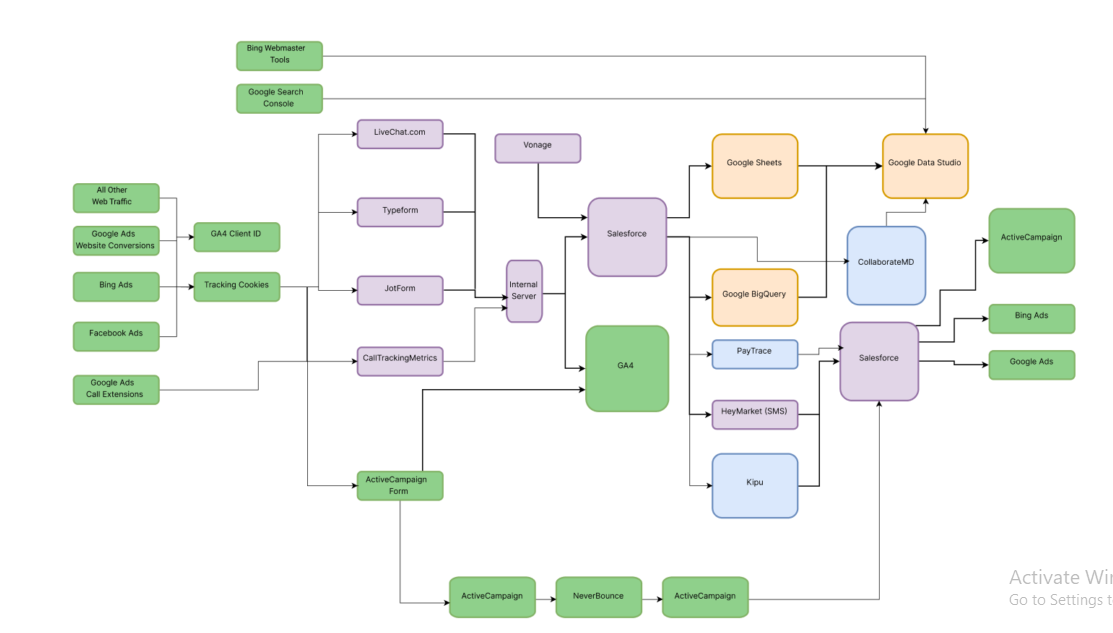
We are a digital marketing company with a focus your entire journey through search - website creation, lead generation, tracking & analysis, & CRM integrations. In this blog we will explain our processes and ideas you can use with your company for better performance.
Request a free quote
We offer professional digital marketing services that help websites improve the performance of their online marketing. Contact us to discuss your website & marketing plans.
More from our blog
See all posts


Recent Posts
- Why you should integrate Jotform to Google Sheets and how to do it February 22, 2024
- Set Up Google Analytics 4: Beginner’s Guide February 15, 2024
- Mobile CTA Optimization: Strategies and Challenges September 11, 2023